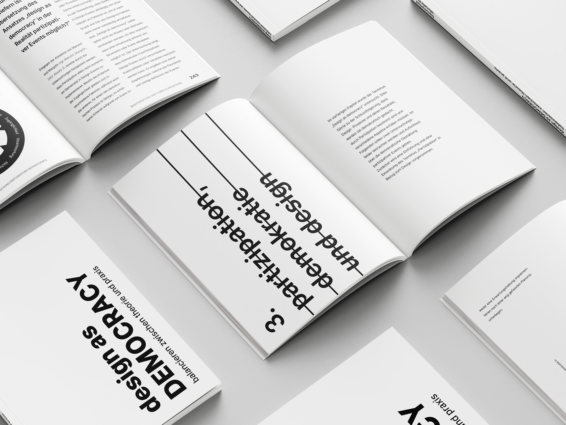
design as democracy - balancing theory and practice is my theoretical diploma thesis. The work focussed on the correlation between design, participation and democracy. The challenge and opportunity for this work was the realisation of an overall graphic concept that matched the scientific content. In addition to the content-related work, the diploma was to be completed with a confident graphic appearance. To learn more about the design realisation of the print edition and other elements, click here:
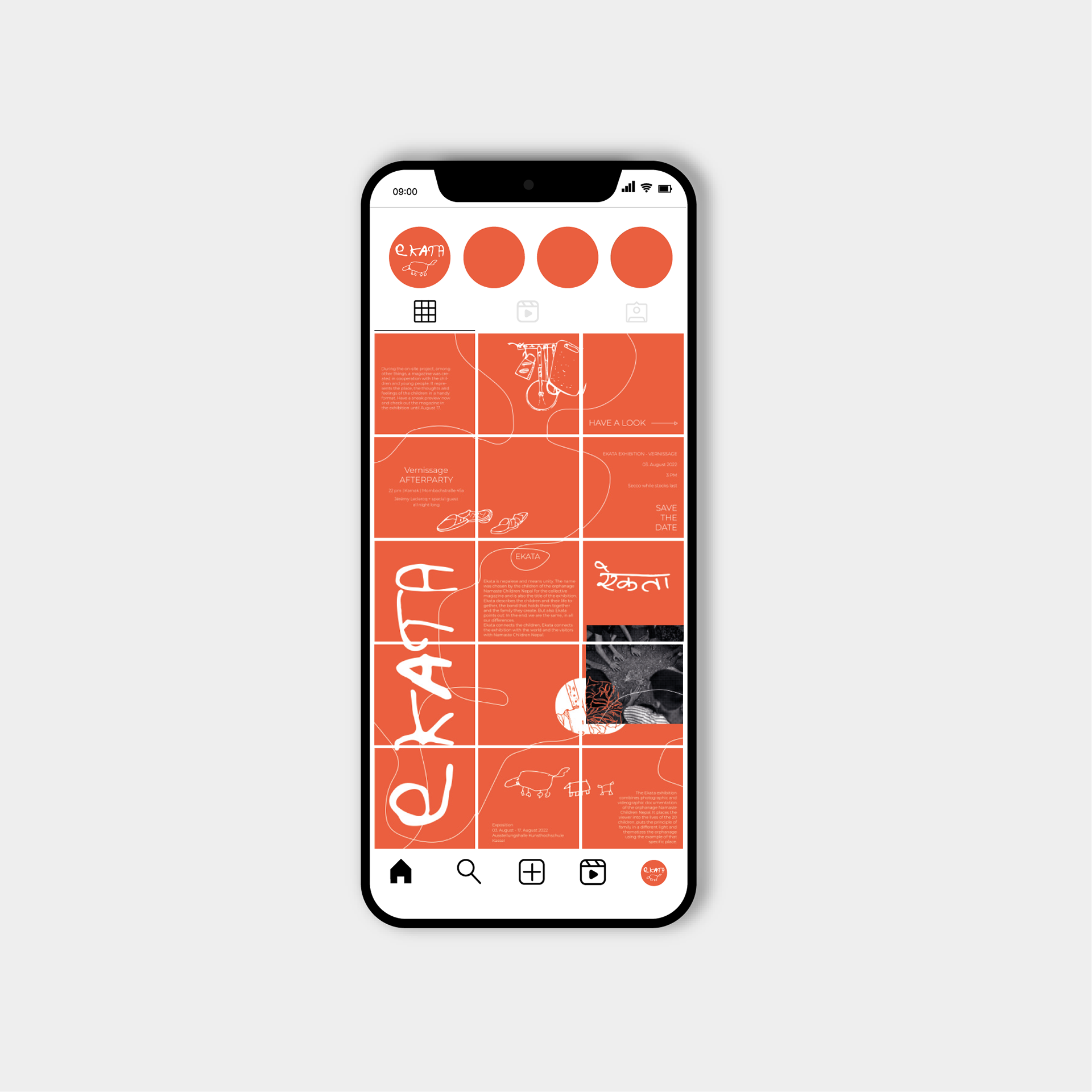
ekata is Nepalese and means unity. The project was developed during a four-month stay in Nepal in co-operation with the Nepalese orphanage "Namaste Children Nepal". The graphic concept is based on the children's work and was developed through a study on site. It utilises playful elements and childlike expression. The project is special in the way that the visual representation was created through interviews, observation and drawings as well as texts by the children.

Girl Boss is a summer project for Flinta* people between the ages of 14 and 18 in the Mannheim and Heidelberg area. The aim is to create a play with the young people about young Flinta people in society. In workshops that include acting as well as rap and dance, the young people will share their own experiences and recognise and use their strengths. The design of the graphic appearance should do without photos and represent strength and diversity. The focus was on the choice of colours, which ultimately led to three different versions. The basic design plays with the stereotypical colours blue and pink and is a reference to gender norms. The project was supervised and designed only by Flinta people, so that it also serves as a statement.
* Flinta is a German term that refers to women, lesbians, intersex, non-binary, trans and agender people.
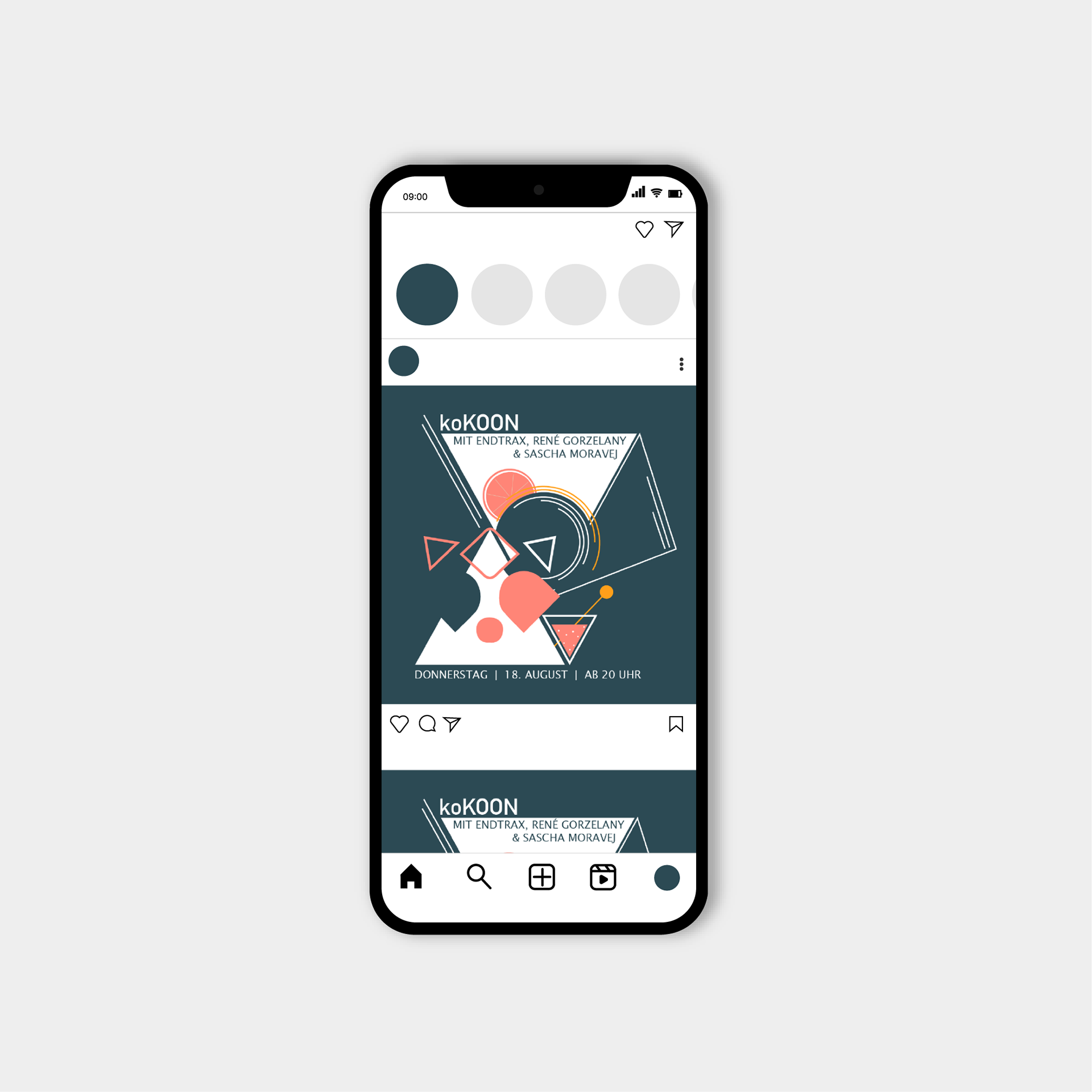
From the beginning of 2021 to the beginning of 2023 I accompanied the Bar Koon Kassel in its graphic presentation. In doing so, I created the social media promotion of the events via Instagram and Facebook. The bar already had a visual appearance that was strongly oriented towards graphic forms, which I took up in the following years. Over the years, I supported various projects and implemented them based on the corporate identity.
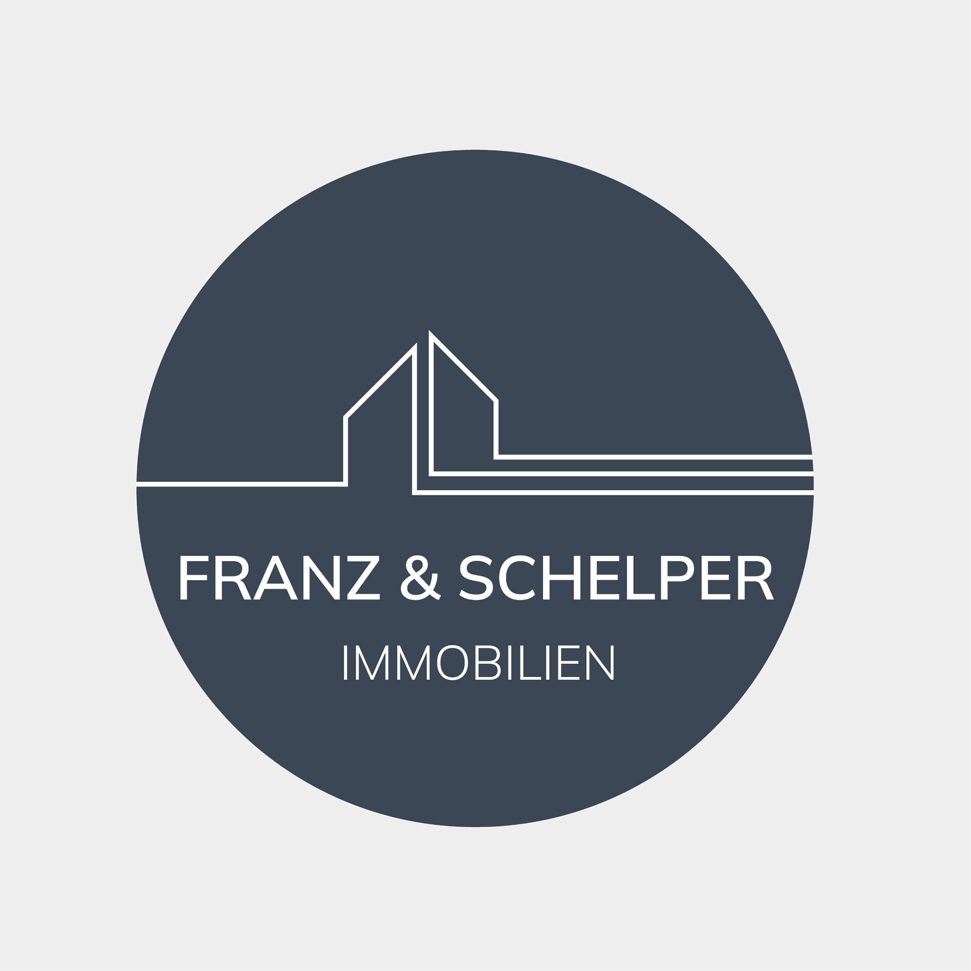
The real estate agency Franz & Schelper is managed by a young team and should also convince with its logo. A simple and plain design was chosen, which uses continuous lines and the shape of the circle to visualise development. There are no boundaries in the logo, but it opens up for possibilities. The continuous lines emphasise dynamism and progression. The logo invites you to take a step and find a new home.
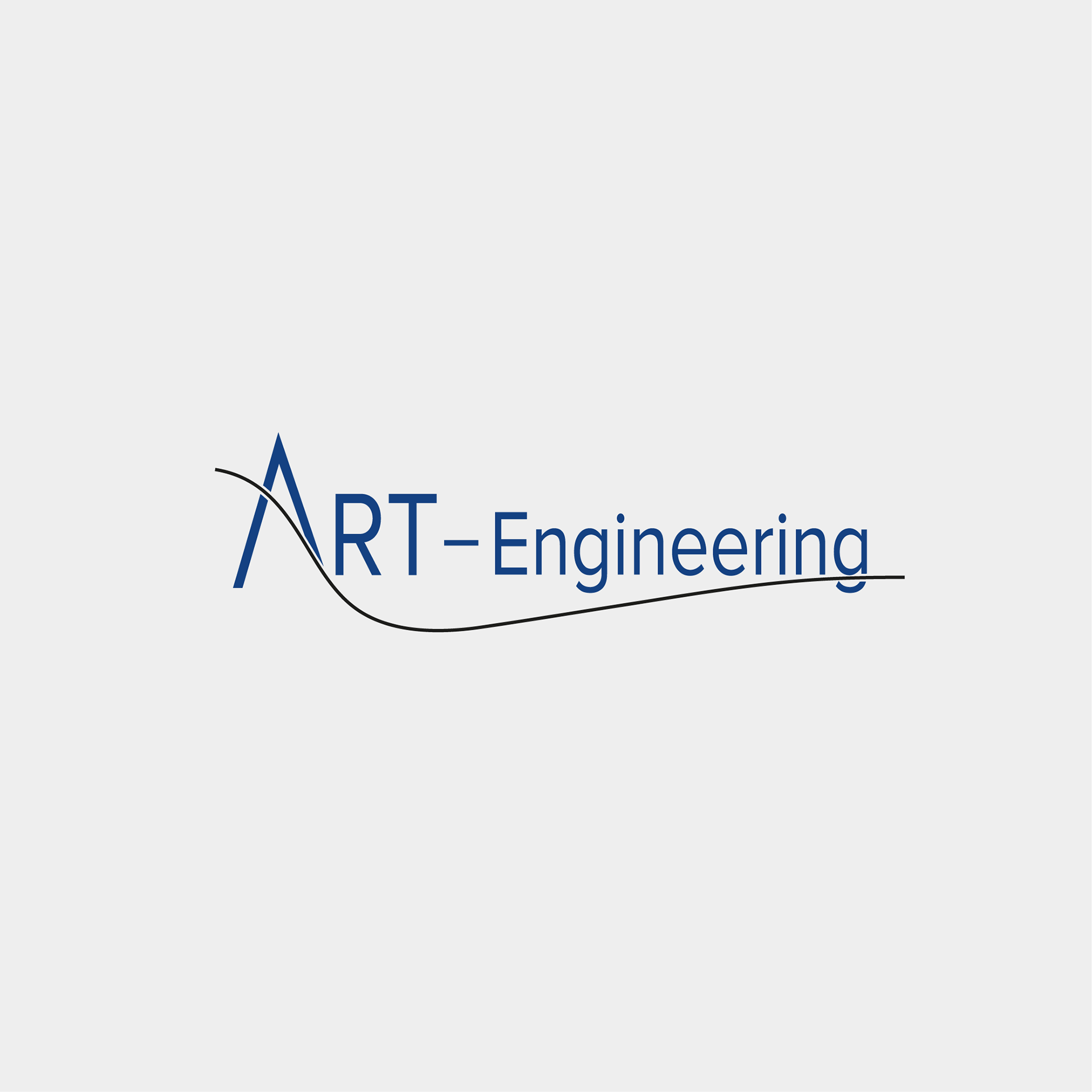
The company Art-Engineering specialises in tribometers and other test stands. The commissioned logo is simple and does not require many shapes. A so-called Stribeck curve is imitated as the line for the 'A'. The curve visualises the frictional force as a function of the frictional speed and is used for named test benches. The adaptation symbolises the company's mechanical and technical expertise.