"It (the thesis) does not offer a set of rules or a solution, it opens up a process that needs to be explored further and, above all, makes one thing clear:
Design as democracy is a concept and an idea, but always remains a balancing act between theory and practice."
Design as democracy is a concept and an idea, but always remains a balancing act between theory and practice."
_____________
This is the last sentence of my theoretical elaboration on the notion of "design as democracy", which was coined in 2017 by Ezio Manzini and Victor Margolin in their letter to the design community. At the same time, it refers to the title and situates the term in a constant development and reflection.
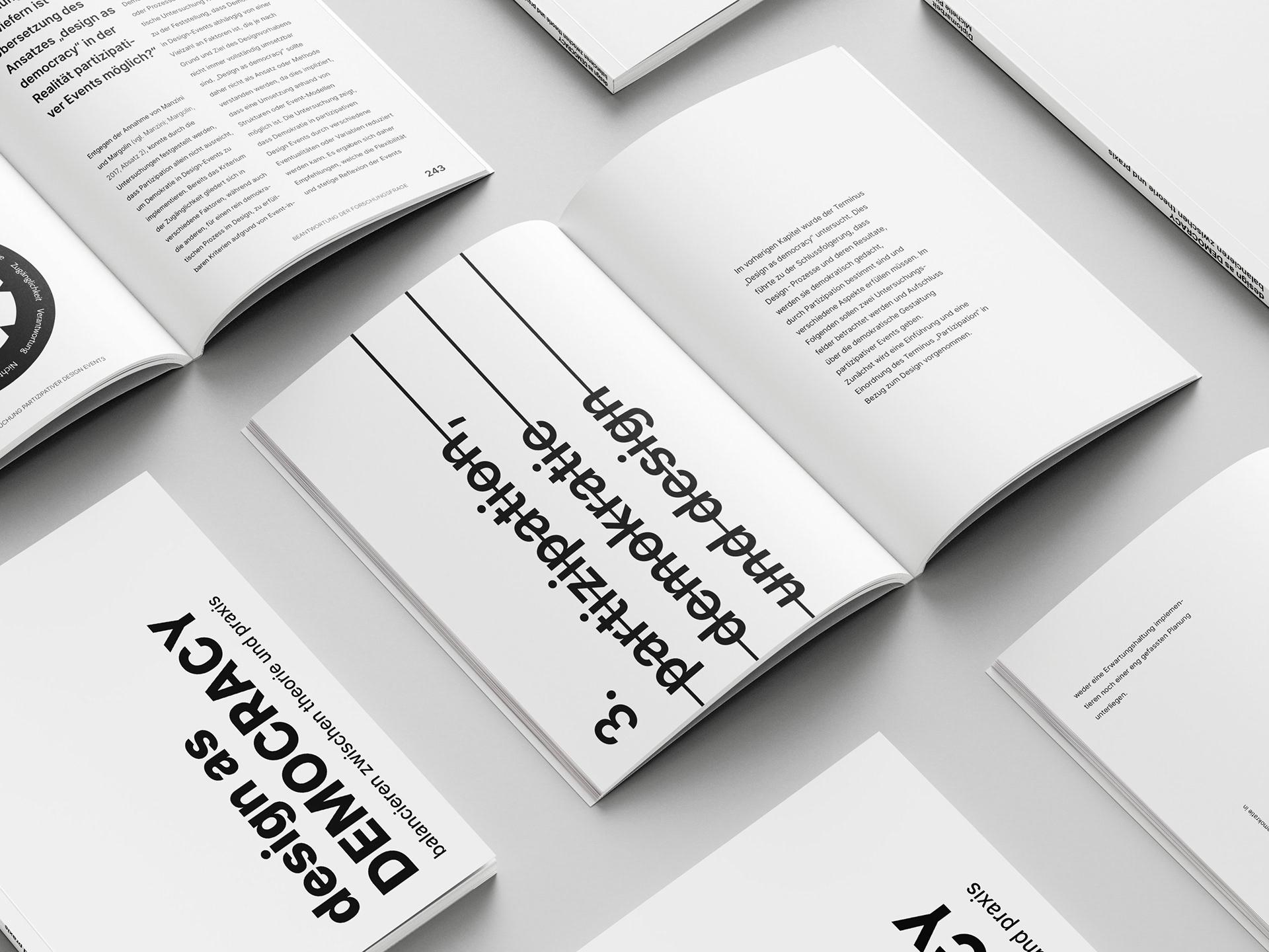
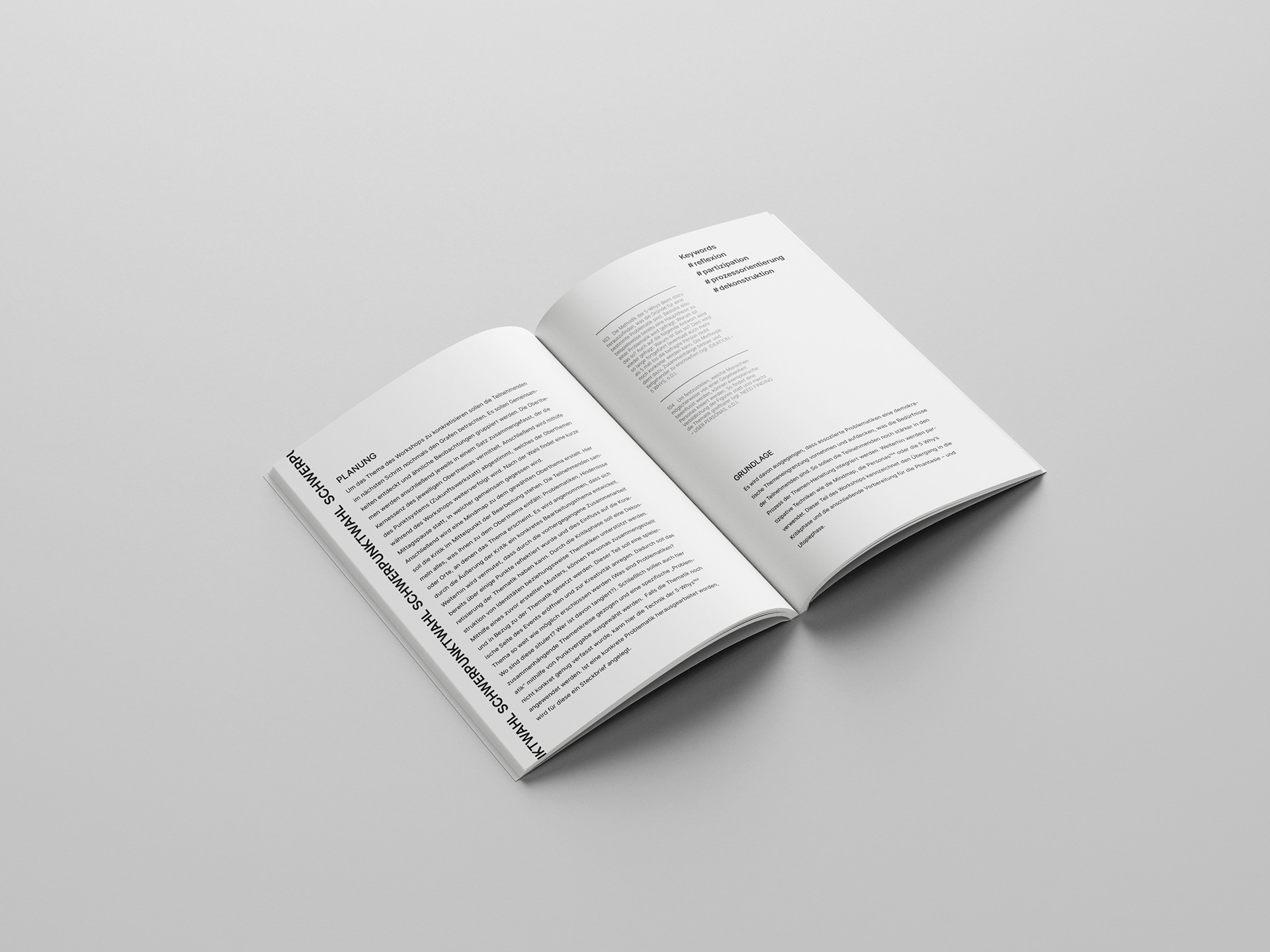
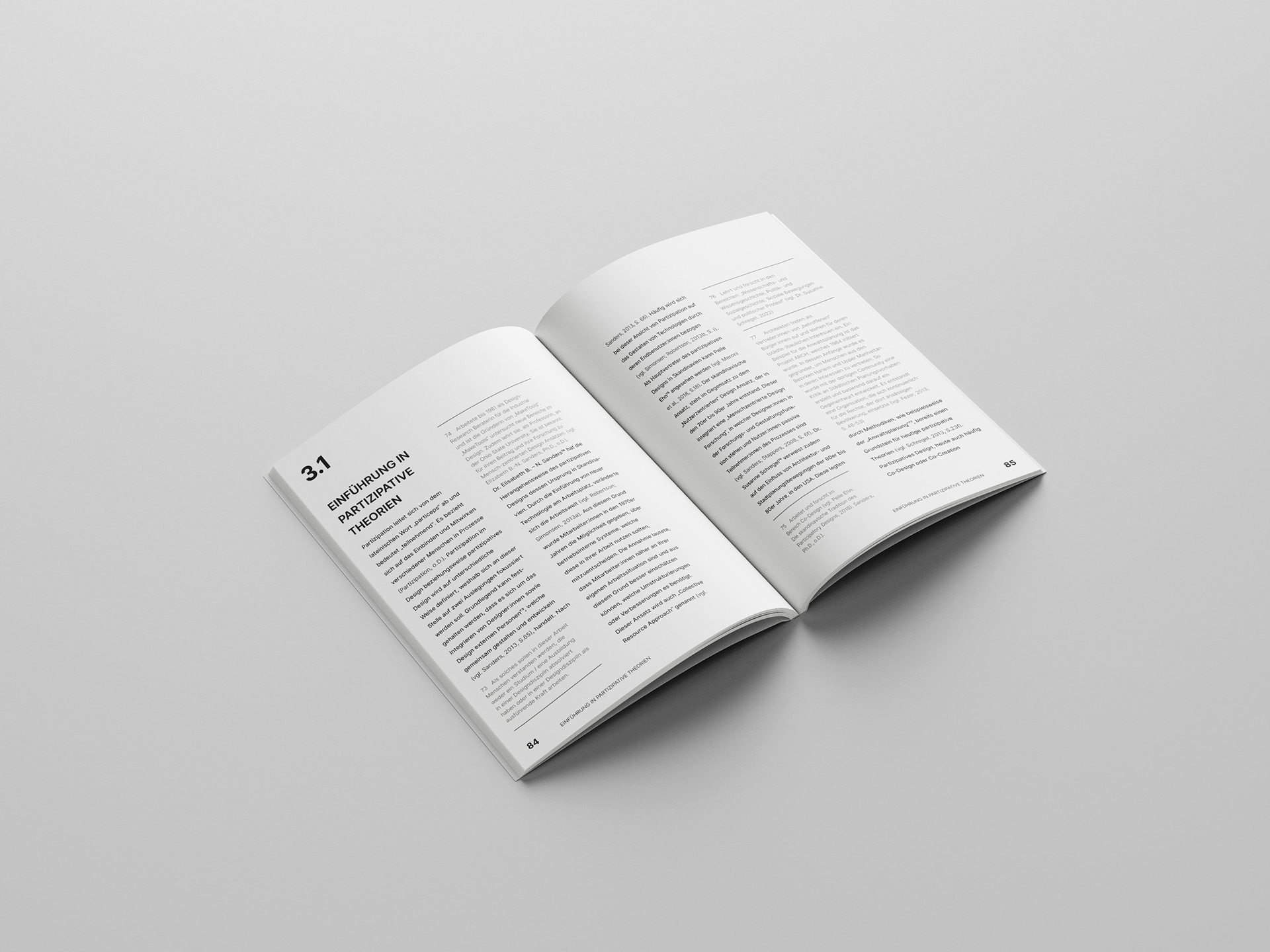
The work, which deals with democracy, participation and design, primarily describes the attempt to carry out design democratically. The focus is initially on ten criteria, which were identified on the basis of a literary study. According to this, a design that is implemented as a democracy should, for example, initially be participative, but also allow for conflict and encourage constant reflection. Design, if implemented democratically, would therefore always have to be a process, but never assumed to be ultimate. This basis was chosen for the graphic realisation of the work.
The work, which deals with democracy, participation and design, primarily describes the attempt to carry out design democratically. The focus is initially on ten criteria, which were identified on the basis of a literary study. According to this, a design that is implemented as a democracy should, for example, initially be participative, but also allow for conflict and encourage constant reflection. Design, if implemented democratically, would therefore always have to be a process, but never assumed to be ultimate. This basis was chosen for the graphic realisation of the work.
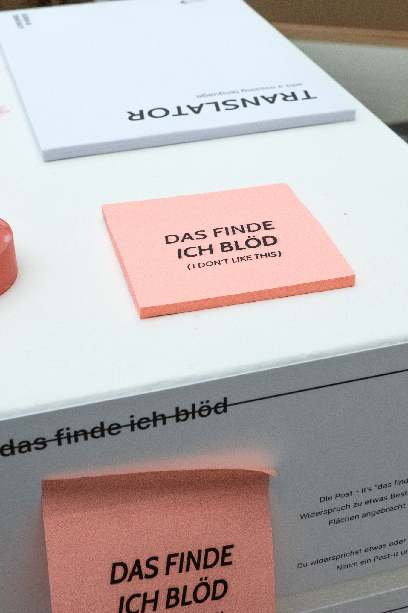
Cross out, rethink
What is right and what is wrong? By crossing out the headings, the justification is questioned. The work thus presents a view of the subject matter, but how do the readers think about it? The topic remains open to question and offers an invitation to change.
THE FONT
The font used is the OpenType font family Inter, which was designed by Rasmus Andersson.
In the context of democracy, a font was selected that is free and accessible. Protest signs provided the inspiration for the choice of a sans serif font. As the book contains little visual material, the font was placed in the centre of the layout. It was also important for the font to be present but still easy to read in long texts.
Cabin Medium Italic, by Impallari Type and Rodrigo Fuenzalida, was used as a further font for quotations.
The font mix formed the basis for the design of the diploma thesis.
No preference - The colour
No colour was deliberately chosen for the design so as not to create a preference. The decision was made in favour of classic black lettering on a white background. To remove the footnotes visually from the main focus, they are presented using a light font in grey.
The colour decision also provides the basis for an additional element: the red pen.
The colour decision also provides the basis for an additional element: the red pen.
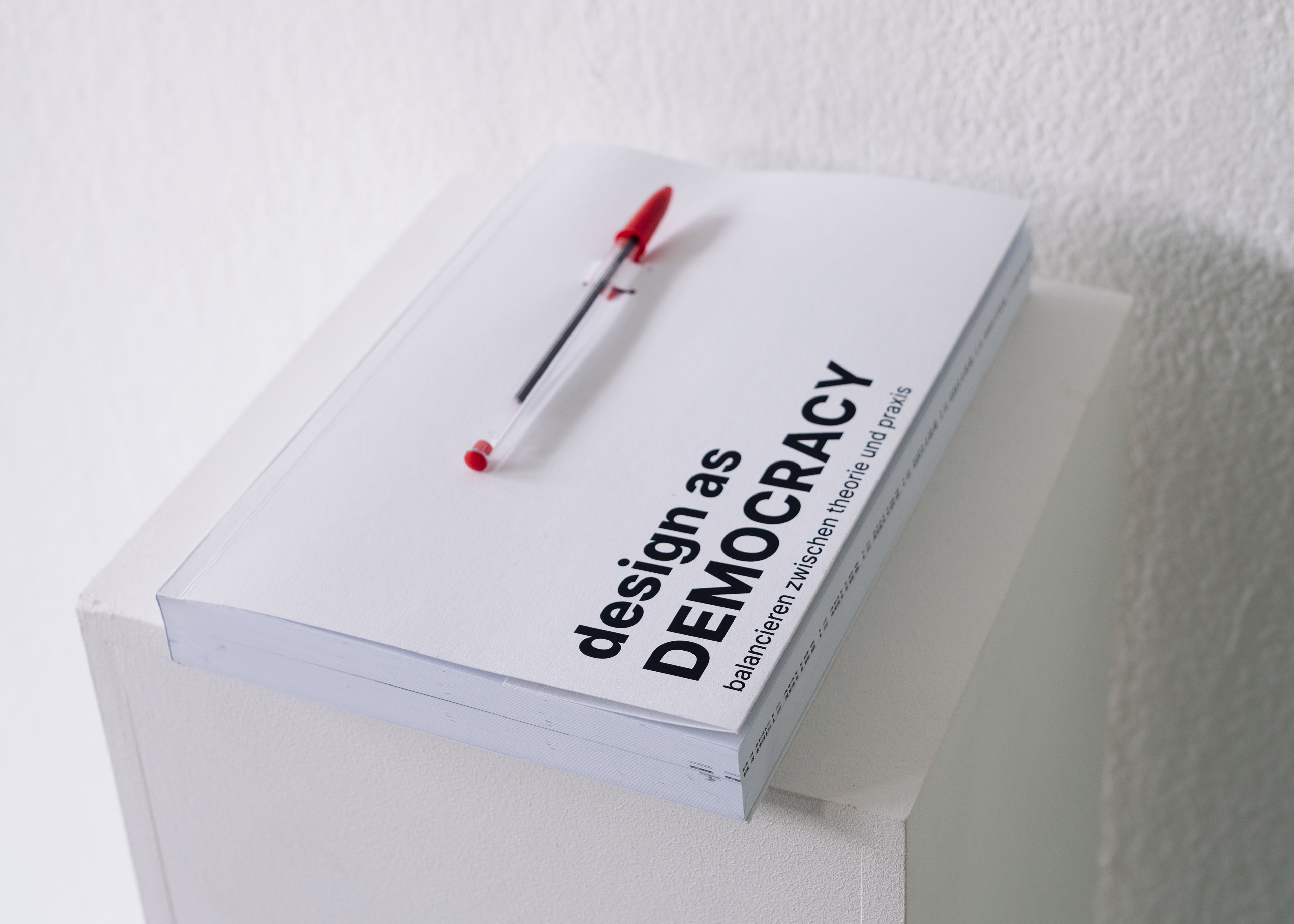
THE RED PEN
The thesis, which focuses on democracy through conflict, comes with a red pen. The red pen, as a symbol for correction, invites you to change, improve or challenge the work.
The simple colouring of the thesis ensures that the pen creates a strong contrast and allows the comments to stand out.
The simple colouring of the thesis ensures that the pen creates a strong contrast and allows the comments to stand out.
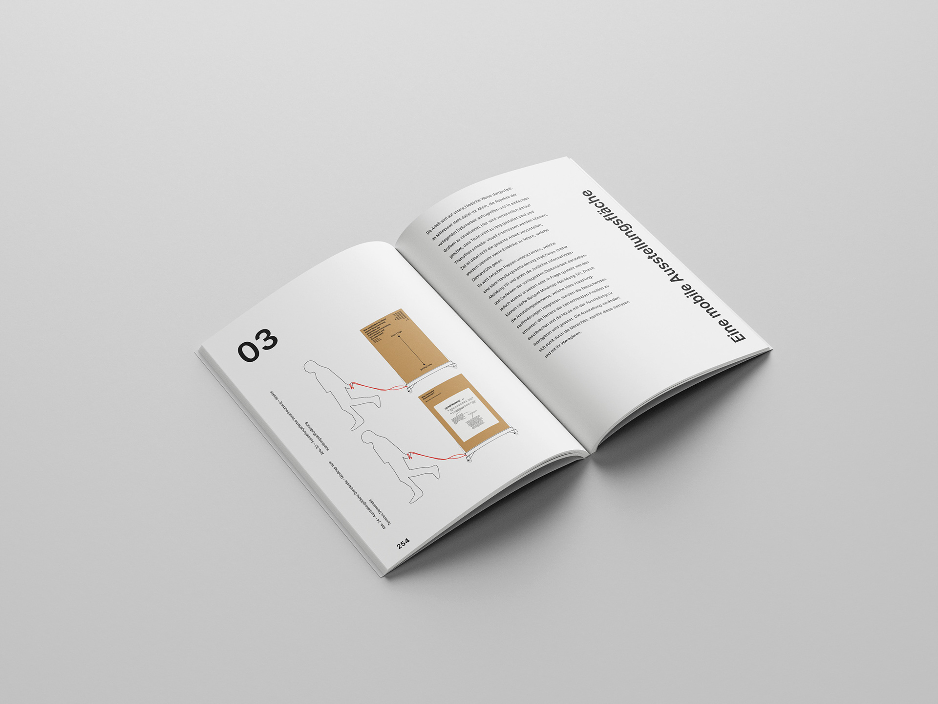
Design as democracy presented
The graphic concept was extended to the presentation elements. The print edition and presentation thus form a unity. Conceived as an interactive exhibition, all elements are connected to each other via the font and form their own visual identity.
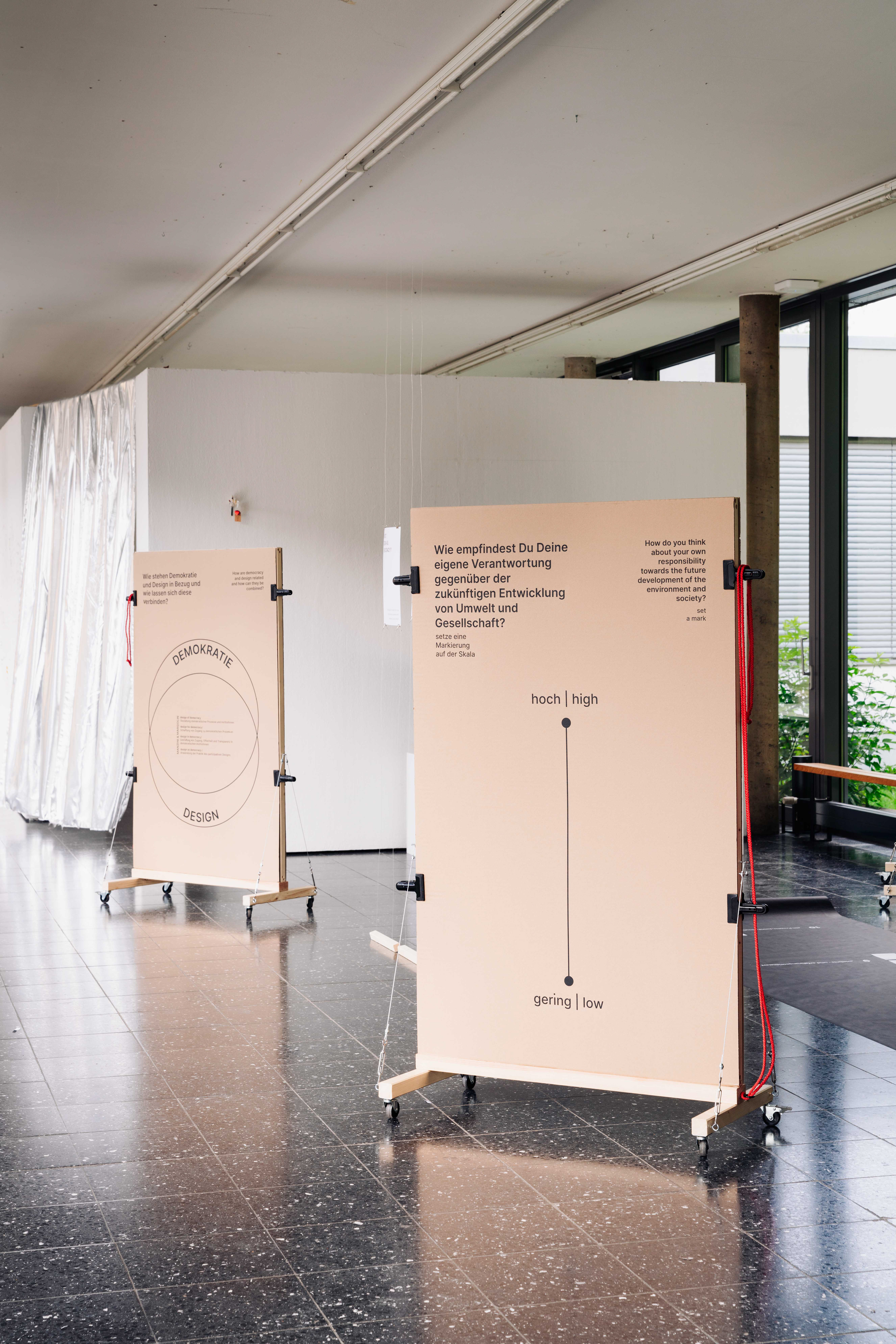
Mobile exhibition displays that can be moved, labeled and exchanged. Photo: Can Wagener
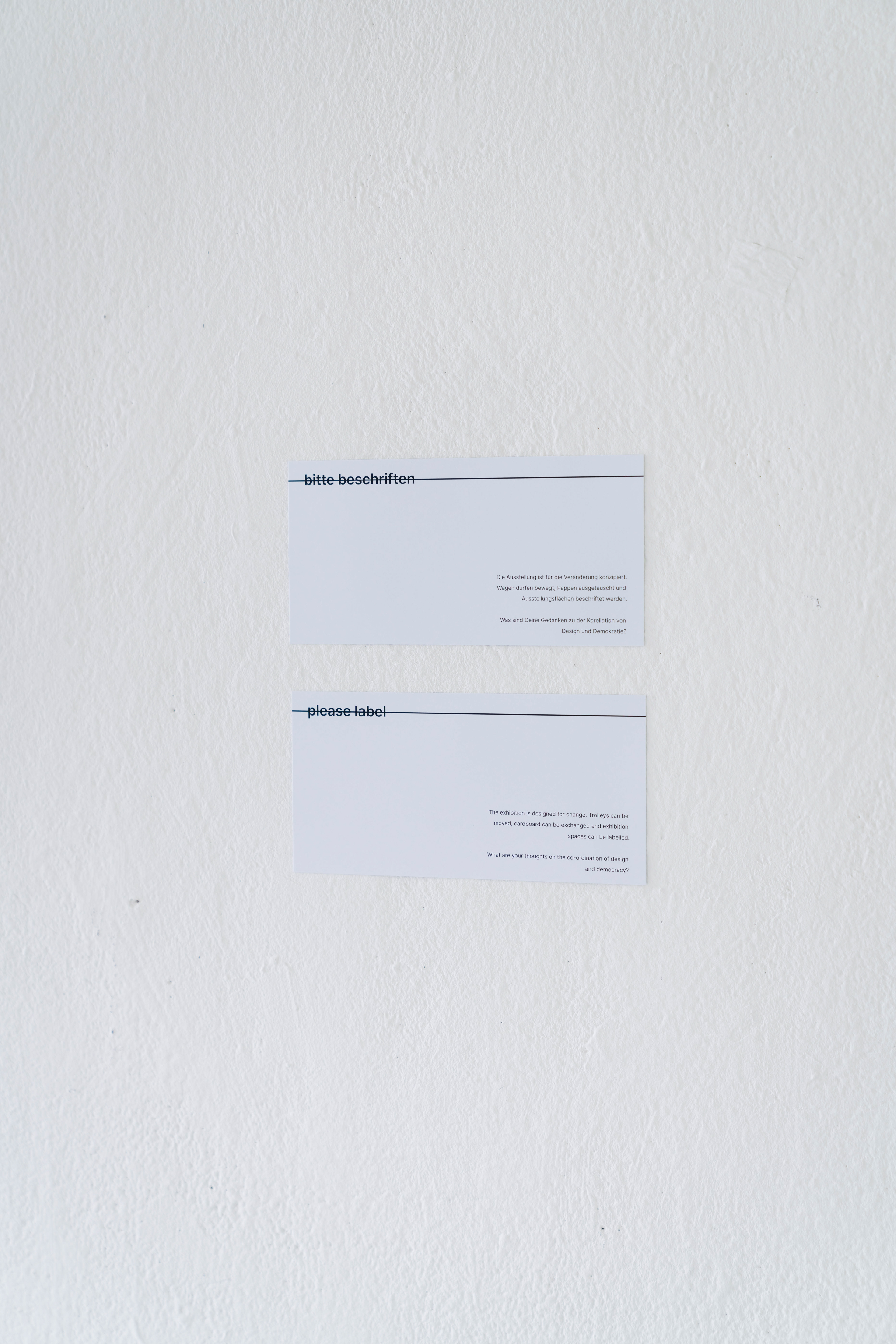
Photo: Can Wagener
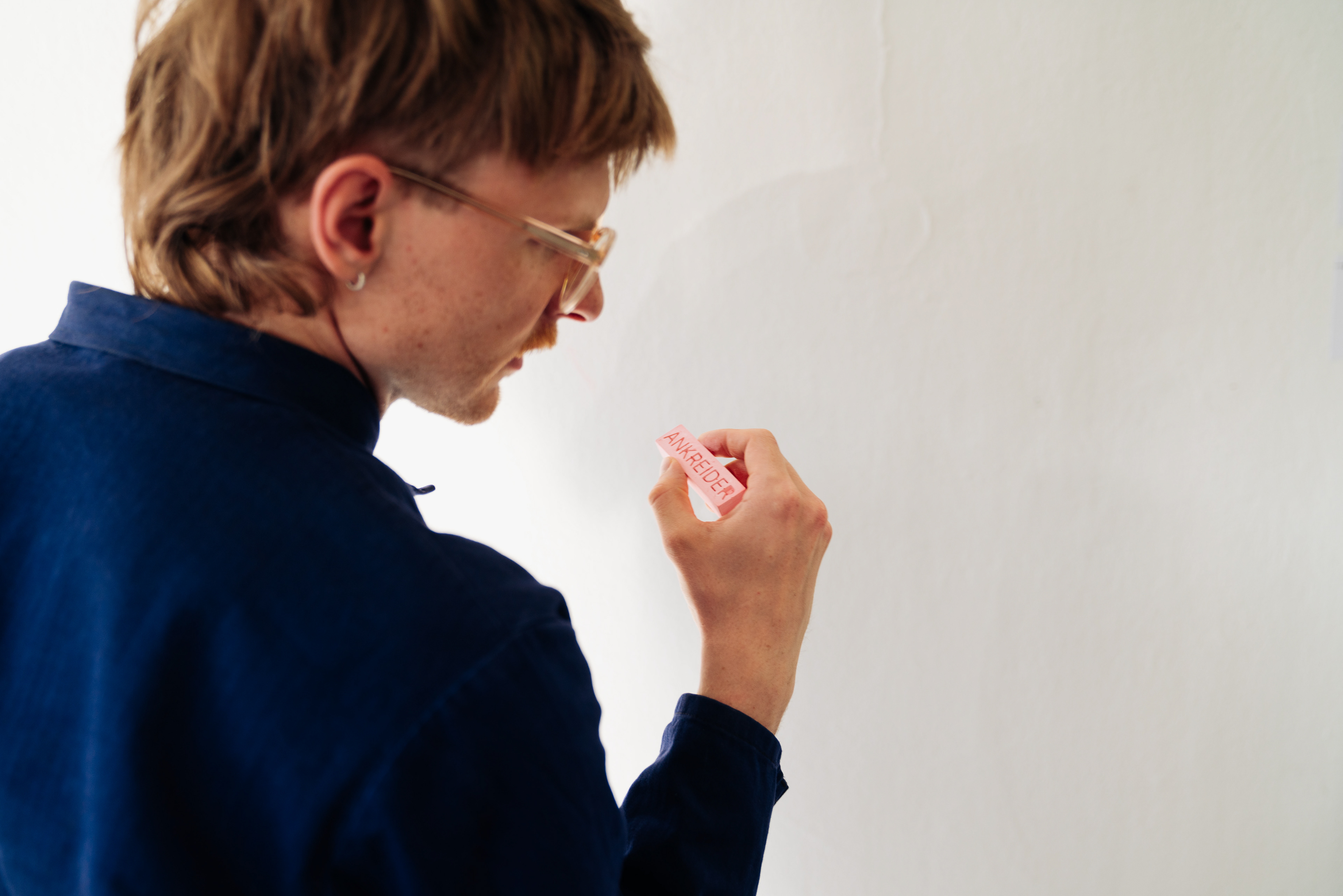
The "Ankreider", a chalk that is designed as a labeling tool and encourages criticism through its name. Photo: Can Wagener