STRONG TOGETHER
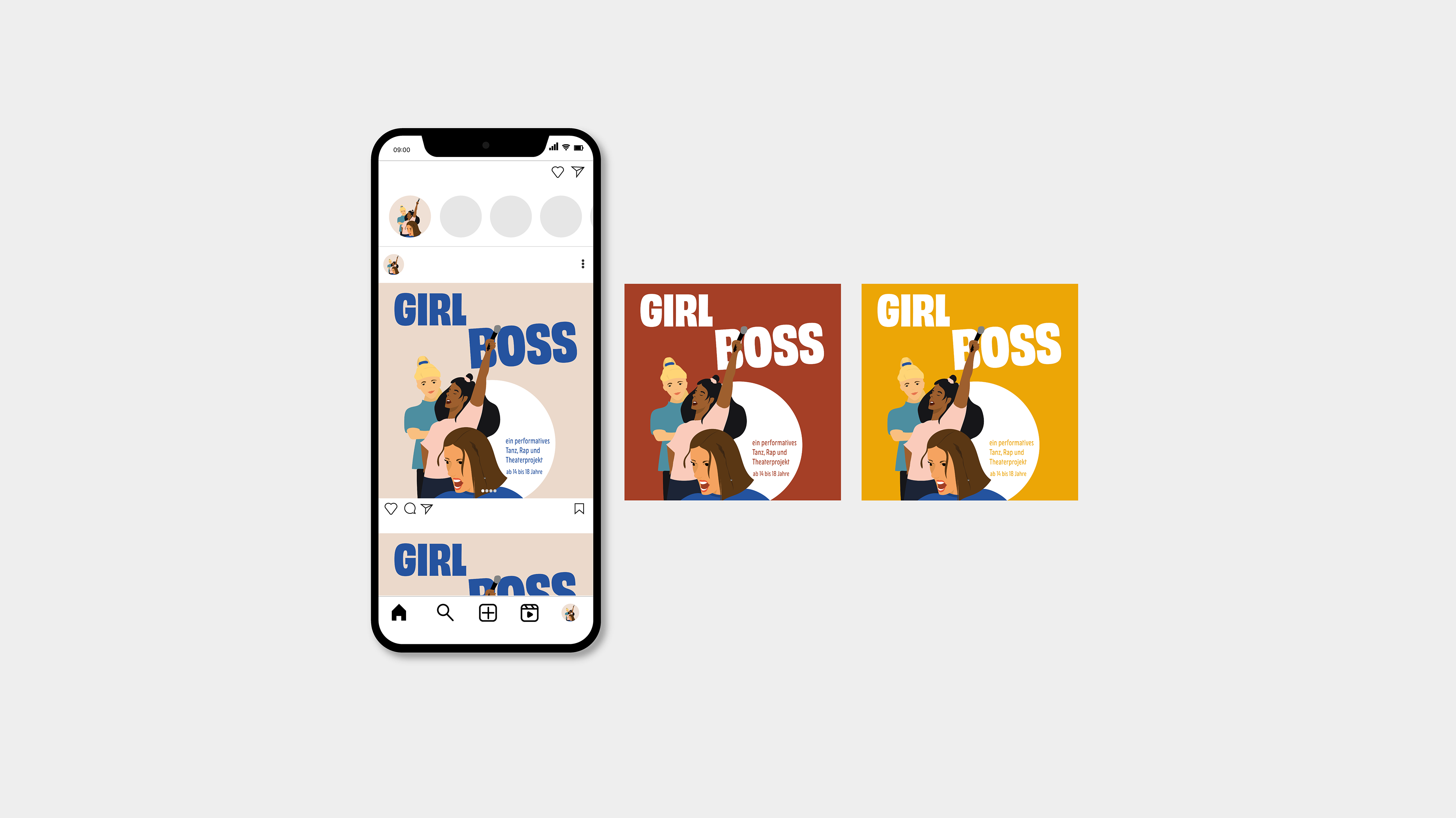
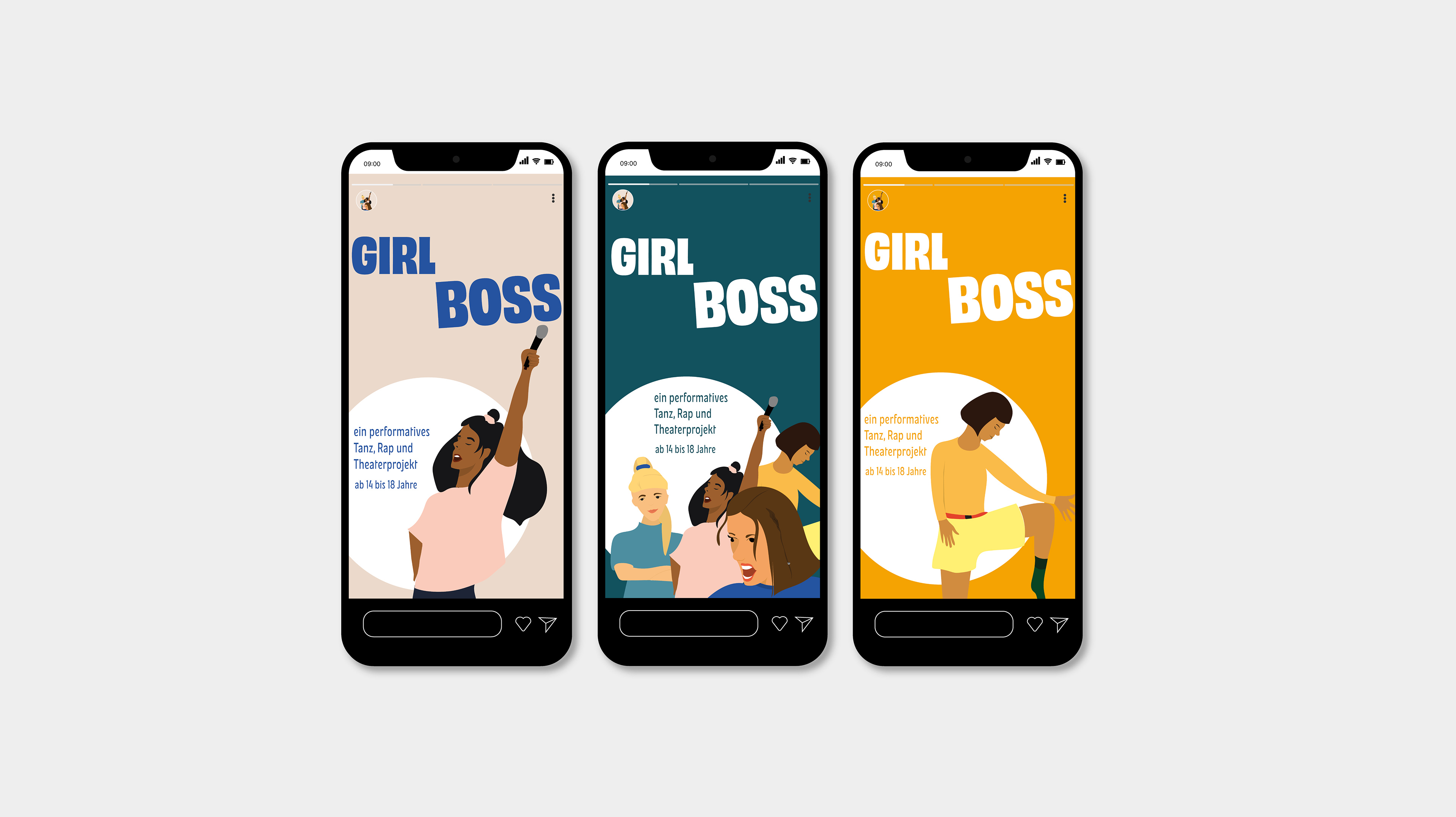
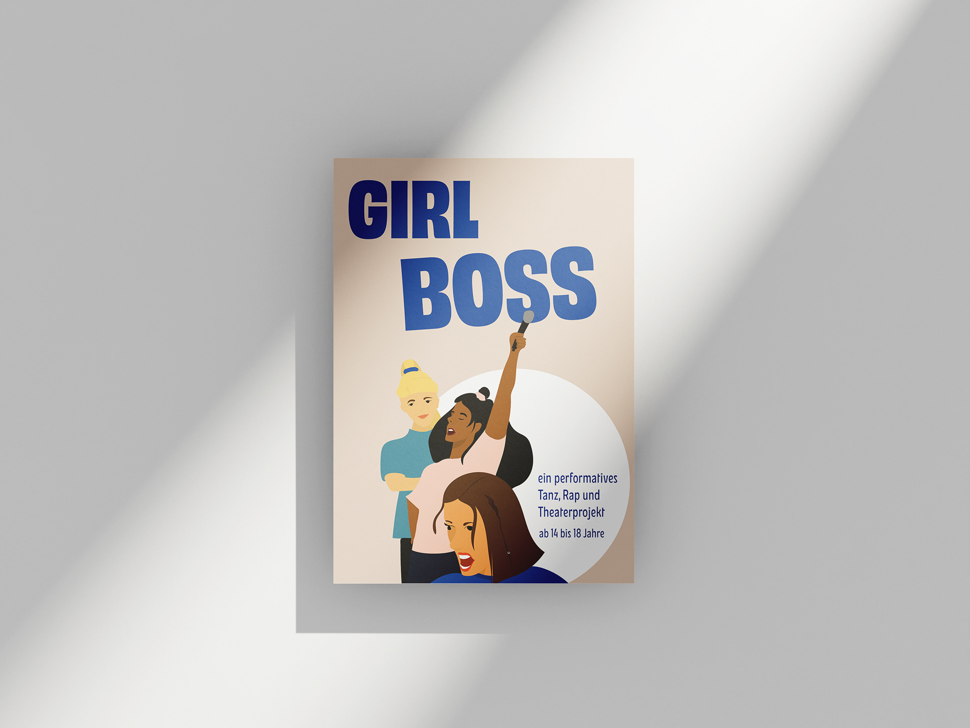
The interdisciplinary dance, rap and theater project was designed for Flinta people between the ages of 14 and 18. In consultation with the planning team, the visual appearance was intended to express both strength and diversity. A flyer and social media graphics were designed for the project.


COLOR OPTION
The final design includes 3 different color concepts. While red and yellow were chosen as two neutral colors, the third color design plays with gender prejudices. Blue and pink are used together and, in conjunction with the title "GIRL BOSS", point to social perceptions. The reference to the piece, which is to be created in collaboration with the Flinta people, therefore arises with the help of the color, which refers to perspectives and questions them. The application of the various color concepts was left to the clients.
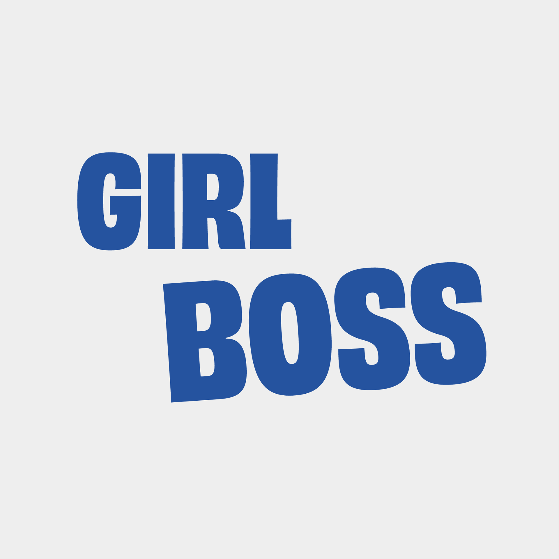
A TYPEFACE THAT STANDS FOR ITSELF
The Narrow Black font style, which belongs to James Edmondson's Obviously font, was chosen for the title. The sans serif typeface fills the space and makes a strong impression. The word BOSS is tipped out of line and encourages thinking outside the box.
The font New Herman is added for the body text. Here, too, a sans serif font was chosen, although its playful lines create a dynamic image.
The font New Herman is added for the body text. Here, too, a sans serif font was chosen, although its playful lines create a dynamic image.